How to Read a Nutrition Label Without Getting Confused
# How to Read a Nutrition Label Without Getting Confused
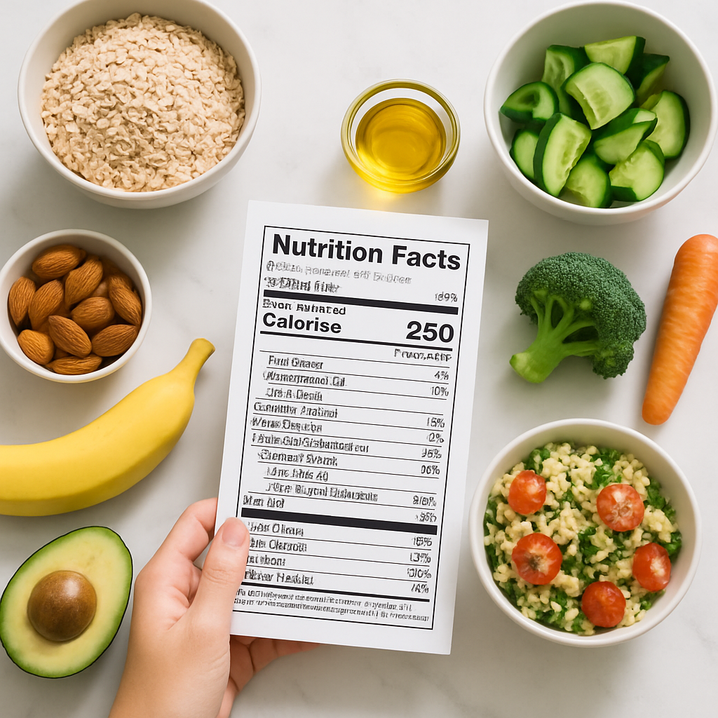
Nutrition labels are supposed to help you make informed choices — but for a lot of people, they do the opposite. Numbers per 100g, numbers per serving, percentages that seem to come from nowhere: it can feel more like a maths exam than a quick trip around the supermarket.
The good news is that once you know what to focus on, reading a label takes about ten seconds.
What You're Actually Looking At
UK nutrition labels follow a standard layout, showing energy (in both kJ and kcal), fat, saturated fat, carbohydrate, sugars, fibre, protein, and salt. Most products display this information per 100g and per serving — and that distinction matters more than people realise.
Per 100g is useful for comparing two similar products against each other. Per serving tells you what you're actually getting if you eat the amount stated on the pack. The catch? Serving sizes are set by the manufacturer, and they're not always realistic. A "serving" of crisps that's listed as 25g is optimistic, to say the least.
Always check what a stated serving actually looks like before taking those numbers at face value.
The Numbers Worth Paying Attention To
You don't need to scrutinise every single row on a label. What's worth your attention depends on your goals, but there are a few figures that are broadly useful for most people.
Calories (kcal) give you the overall energy picture. Protein is worth checking if you're trying to hit a daily target — it keeps you fuller for longer and supports muscle repair. Fibre is one most people undereat, so it's genuinely helpful to get a sense of how much is in what you're eating. The recommended intake in the UK is 30g per day, and most people get closer to 18g.
Saturated fat and salt are the two to be more aware of if you have specific health considerations like heart health or blood pressure. The traffic light system on the front of many packs (red, amber, green) is a quick shortcut here — it's not perfect, but it does the job for a fast scan.
The Sugar Confusion, Sorted
"Total sugars" on a label includes both naturally occurring sugars (like those in milk or fruit) and added sugars. These two things behave quite differently in your body and in your diet, but the label lumps them together — which is where a lot of confusion comes from.
A plain yoghurt and a flavoured yoghurt might both show 10g of sugar per serving, but one of those is largely lactose (naturally present in dairy) and the other has added sugar on top. The ingredients list is your friend here: if sugar, syrup, honey, or anything ending in "-ose" appears near the top, that's a sign there's a meaningful amount of added sugar in the product.
The label itself won't always tell you the full story — but pairing it with a quick scan of the ingredients gives you a much clearer picture.
Front-of-Pack Labels and When to Trust Them
The coloured traffic light panels you see on the front of many products are part of a voluntary UK scheme and display key nutrients at a glance. Green means low, amber means medium, red means high — based on the per serving amount, not per 100g.
They're a useful tool, but not the whole story. A product with a red for fat isn't automatically a poor choice — full-fat dairy and oily fish both sit in that category, and both have solid nutritional credentials. Context and overall diet matter far more than any single label.
Use traffic lights as a quick reference, not a verdict.
Practical Takeaways
- Compare products per 100g, but check per serving for your actual intake
- Focus on the numbers relevant to your goals — you don't need to read every row every time
- Pair the nutrition panel with the ingredients list to understand sugar sources
- Traffic light labels are a helpful shortcut, not the final word
Label reading gets faster with practice. Once you know the layout and what you're looking for, it becomes second nature rather than a chore.
If you want to stop doing the mental maths every time you eat, Macrology generates macro-perfect meal plans in seconds — https://macrology.app/signin
Want meals like this planned to your exact macros?
Macrology generates a personalised meal plan in seconds — breakfast, lunch, dinner and snacks, all hitting your daily targets.
Start your free 14-day trial